library("tidyverse")

set.seed(42)

# Generate data from a mixture of distributions that together suggest a
# light bulb silhouette, while retaining natural violin chart texture.
#
# Three components:
#   1. Large round bulb body — beta distribution centered ~0.65, wide spread
#   2. Neck pinch — small cluster of points near 0.18, very tight
#   3. Base cap — uniform-ish cluster near 0.06, narrow
n_bulb <- 3000
n_neck <- 180
n_base <- 300

# beta(2.5,4) skews the peak toward the lower end of the range,
# so when mapped to [0.22, 1.0] the widest point sits around 0.50-0.55
# and the upper half tapers like a dome rather than coming to a sharp diamond point
bulb <- rbeta(n_bulb, shape1 = 3, shape2 = 3) * 0.75 + 0.22
neck <- rnorm(n_neck, mean = 0.175, sd = 0.015)
base <- rnorm(n_base, mean = 0.07, sd = 0.020)

bulb_data <- tibble(
  x = "bulb",
  y = c(bulb, neck, base)
)

p <- ggplot(bulb_data, aes(x = x, y = y)) +
  geom_violin(
    fill = "#FFD700",
    color = "blue",
    linewidth = 1.2,
    bw = 0.04,
    trim = TRUE
  ) +
  coord_cartesian(xlim = c(0.55, 1.45)) +
  theme_void()

pI’m working on Visible Data’s iconography for the POUR-CAF principles and wanted to create something a different for the “understand” icon that avoided simply “brain” and also looked like a chart. Thankfully, I had a lightbulb moment. Lightbulb look like violin charts (or the other way round).
Visible Data has a premium subscription to Flaticons, which includes this lovely lightbulb icon.

I prompted Claude to generate a dataset that when visualised as a violin chart had a similar outline to that shape. It ended up trying to get exactly the outline before I had to interrupt and get something less perfect:

All from this code:
Was that fun? Was it inkeeping with my ethics?
This whole thing took about 30mins from conception to image I can add into Canva. That’s so much faster than if I’d have done this completely from scratch. I also really don’t know the parameters of the beta distribution well enough to have done this in less than 2h.
Did I enjoy it? Yes. That was fun. Was it inkeeping with my ethics? Eirgh.
I used a licensed image to get an outline. That’s kind of similar to when I trace images in Procreate in my spare time? Maybe.
I told Claude I wanted to use geom_violin and loaded the tidyverse for it. So I used my knowledge of how {ggplot2} worked instead of just “make this however”
I am fine-tuning the chart and embellishing it for the final icon.
Evenutally I settled on using this code:
library("tidyverse")
library("GPCDStools")

set.seed(42)

# Generate data from a mixture of distributions that together suggest a
# light bulb silhouette, while retaining natural violin chart texture.
#
# Three components:
#   1. Large round bulb body — beta distribution centered ~0.65, wide spread
#   2. Neck pinch — small cluster of points near 0.18, very tight
#   3. Base cap — uniform-ish cluster near 0.06, narrow
n_bulb <- 3000
n_neck <- 180
n_base <- 300

# beta(2.5,4) skews the peak toward the lower end of the range,
# so when mapped to [0.22, 1.0] the widest point sits around 0.50-0.55
# and the upper half tapers like a dome rather than coming to a sharp diamond point
bulb <- rbeta(n_bulb, shape1 = 3, shape2 = 3) * 0.75 + 0.22
neck <- rnorm(n_neck, mean = 0.175, sd = 0.015)
base <- rnorm(n_base, mean = 0.07, sd = 0.020)

bulb_data <- tibble(
  x = "bulb",
  y = c(bulb, neck, base)
)

bulb_glass <- ggplot(bulb_data, aes(x = x, y = y)) +
  geom_violin(
    fill = cols_gpcds$story_primary,
    color = cols_gpcds$ux_blue_mid,
    linewidth = 3,
    bw = 0.04,
    trim = TRUE
  ) +
  coord_cartesian(xlim = c(0.55, 1.45)) +
  theme_void()

ggsave(
  quarto_here("bulb_violin_glass.png"),
  bulb_glass,
  width = 6,
  height = 6,
  dpi = 150
)

bulb_transparent <- ggplot(bulb_data, aes(x = x, y = y)) +
  geom_violin(
    fill = "transparent",
    color = cols_gpcds$ux_blue_mid,
    linewidth = 3,
    bw = 0.04,
    trim = TRUE
  ) +
  coord_cartesian(xlim = c(0.55, 1.45)) +
  theme_void()

bulb_glow <- ggplot(bulb_data, aes(x = x, y = y)) +
  geom_violin(
    fill = cols_gpcds$story_primary,
    color = "transparent",
    linewidth = 3,
    bw = 0.04,
    trim = TRUE
  ) +
  coord_cartesian(xlim = c(0.55, 1.45)) +
  theme_void()

ggsave(
  quarto_here("bulb_violin_glow.png"),
  bulb_glow,
  width = 6,
  height = 6,
  dpi = 150
)

bulb_transparent <- ggplot(bulb_data, aes(x = x, y = y)) +
  geom_violin(
    fill = "transparent",
    color = cols_gpcds$ux_blue_mid,
    linewidth = 3,
    bw = 0.04,
    trim = TRUE
  ) +
  coord_cartesian(xlim = c(0.55, 1.45)) +
  theme_void()

ggsave(
  quarto_here("bulb_violin_transparent.png"),
  bulb_transparent,
  width = 6,
  height = 6,
  dpi = 150
)

bulb_bayonet <- ggplot(bulb_data, aes(x = x, y = y)) +
  geom_violin(
    fill = "#8f8f94",
    color = "#8f8f94",
    linewidth = 3,
    bw = 0.04,
    trim = TRUE
  ) +
  coord_cartesian(xlim = c(0.55, 1.45)) +
  theme_void()

ggsave(
  quarto_here("bulb_violin_bayonet.png"),
  bulb_bayonet,
  width = 6,
  height = 6,
  dpi = 150
)
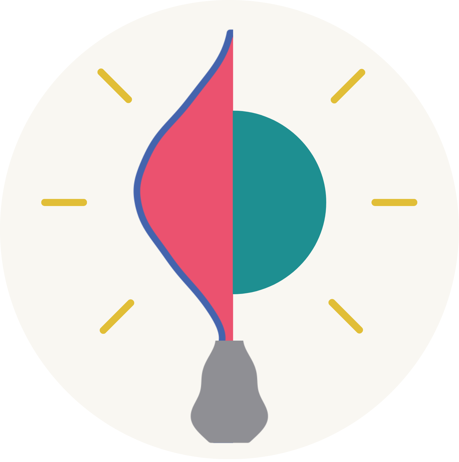
All of this came together into this first-generation icon for the “understandable” principle: